ATLANTIS
TRANSPORTATION HUB
Data-Driven Display
BACKGROUND
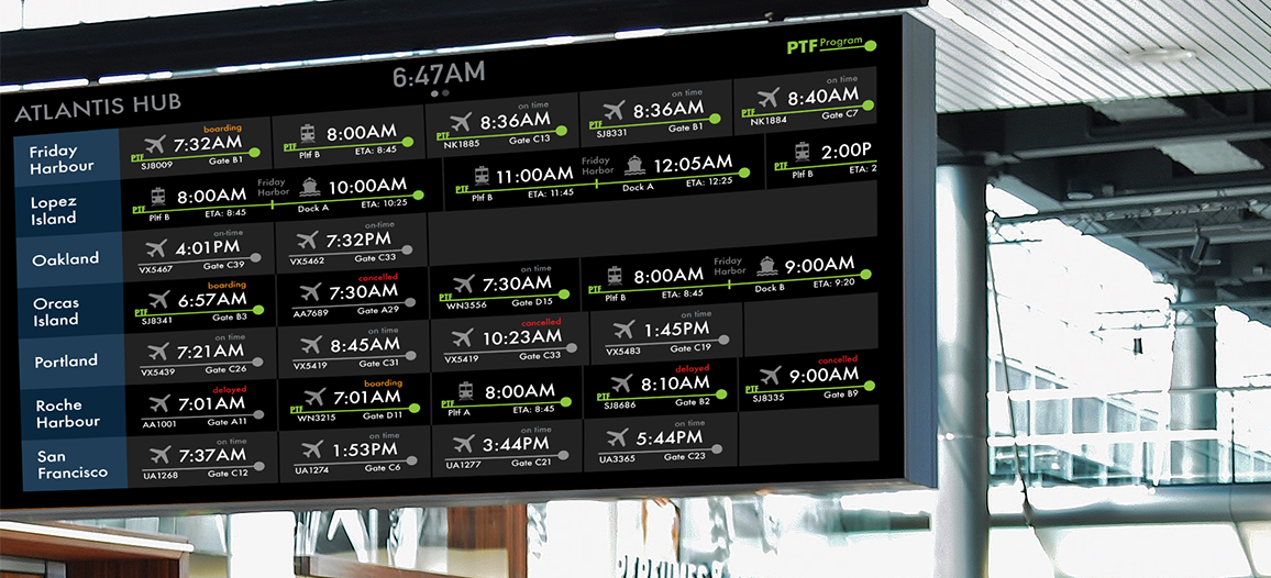
For an Interaction Design Course I was given personas and data, then asked to design a data-driven environmental display providing flight, train, and ferry trvel information. The non-scrolling interface is animated allowing the user to view and process more information.MY ROLE
This was an individual project with some group work at the beginning to analyze the personas and data provided to us.STAKEHOLDER AND USER PERSONAS
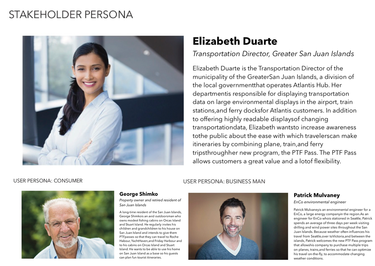
We were provided with one stakeholder and two user personas accompanied with a spreadsheet of data for flight, train, and ferry transportation methods.
EXPLORE DATA AND PERSONAS
REVIEW DATA
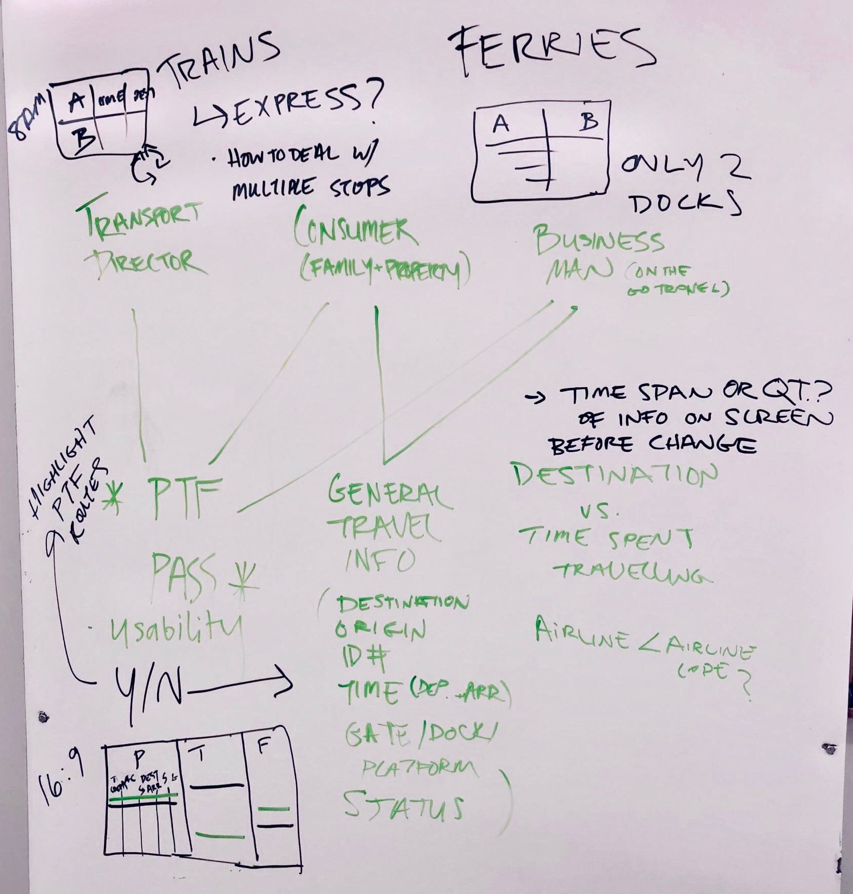
In a group of three, we reviewed the personas and data to create a mapping between the users/stakeholder and the data.
FINDINGS
The PTF Pass was really important to all three personas.
General travel information is important to all users, therefore we listed the information that must show up for transportation options.
QUESTIONS
Should the amount of information displayed be based on a time span or a quantity of travel options? How can we clearly display multiple stops? Is it important for the airline name to show up or is the airline code enough information?
HAND SKETCHES
GOAL
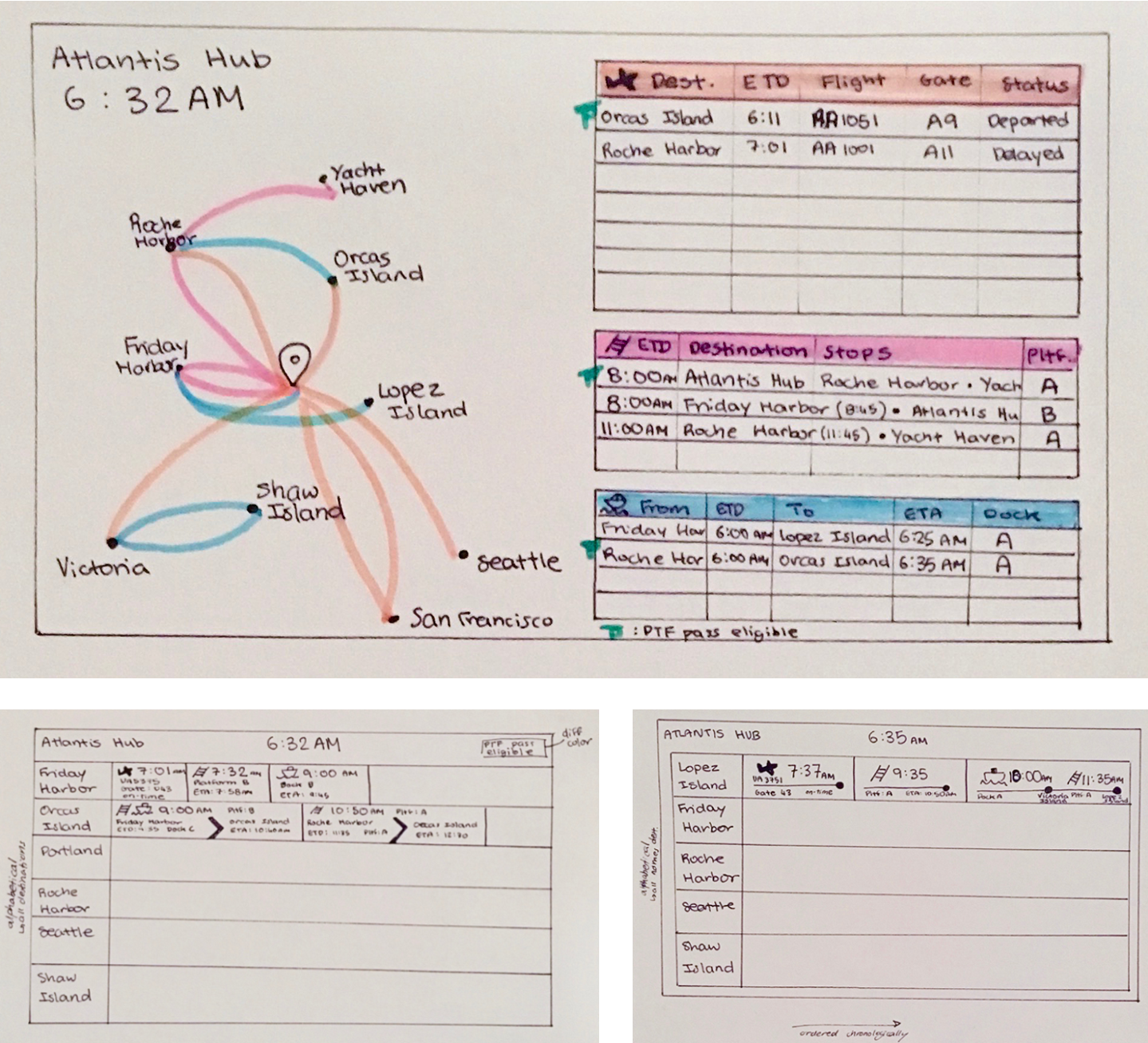
I was not yet sure what the main focus of the display should be so I explored this through the hand sketches
1ST SKETCH
This sketch focused on the different types of transportation therefore I separated the travel options by plane, train, and ferry. I added a map to visually show the transportation types available to each destination.
2ND & 3RD SKETCH
These sketches focus on categorizing the transportation options by destination. One of the goals of this is to better display train to ferry connections to certain destinations.
DIGITAL SKETCHES AND EDITS


HIERARCHY
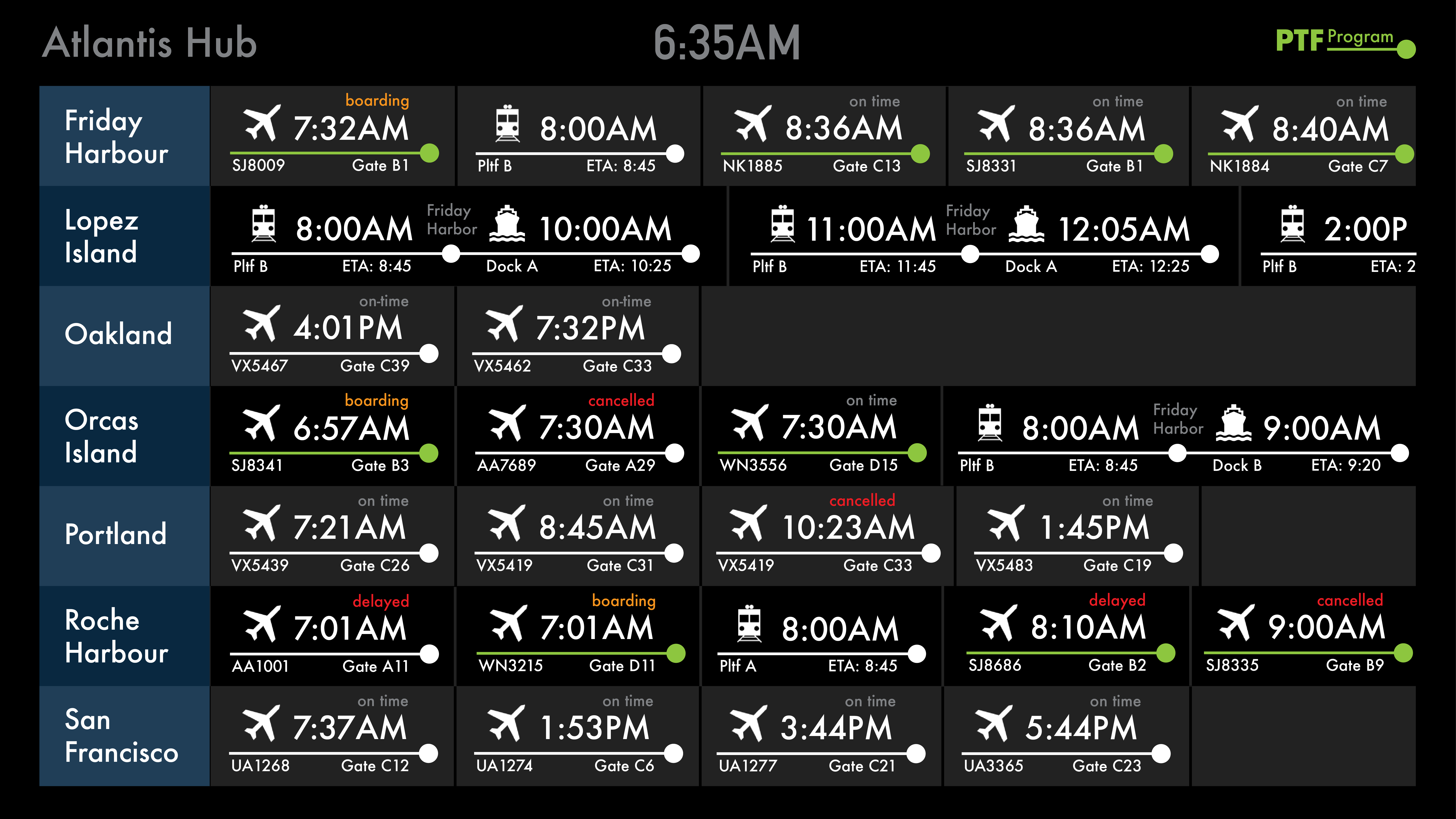
I categorize the transportation options by destination. The next three most important information details are the departure time, the transportation method, and the PTF eligibility.
Therefore I made the departure times and the transportation method icons the largest and added color to indicate PTF eligible options.
FEEDBACK
PTF Pass eligibility must be more obvious.
Colorblind traveler might not be able to distinguish PTF eligible and non eligible options.
Each transportation option needs more space to breath.
FINAL VERSION WITH ANIMATION
PERSONAS
The final version of the data display satisfies the stakeholder’s desires of increase awareness about the PTF Program. It also provides the necessary travel information for both user personas.
ANIMATION
Only half the destinations are displayed at a time, therefore these switch out to display the remaining destinations.