CONNEXTION
UI / UX Design
BACKGROUND
Topic : University X IndustryFor an Interaction Design Course, another group of classmates provided our group with a research packet on a chosen topic: the intersection between university and industry. From this research, we designed a mobile application geared to better the collaboration between universities and industry.
MY ROLE
Our group collaborated on the research and then brainstormed together around our individual ideas. We each created our own storyboards, wireframe iterations, and final wireframes. I also worked on the final clickthrough demo.PERSONAS
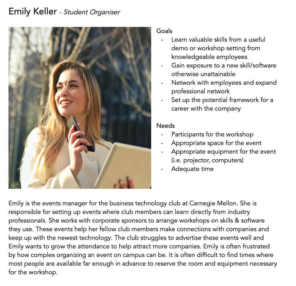
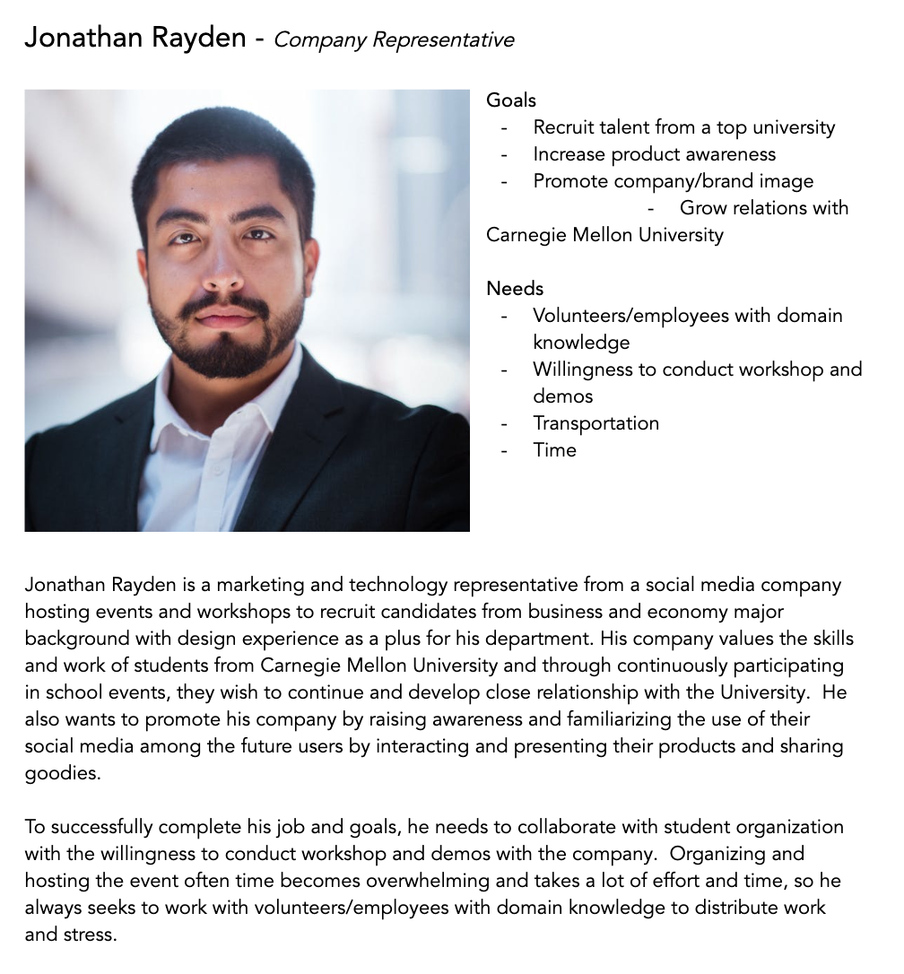
From the research another team provided for us, our team came up with two user personas to clarify who our target audiences were and the goals for the mobile application.
BRAINSTORMING
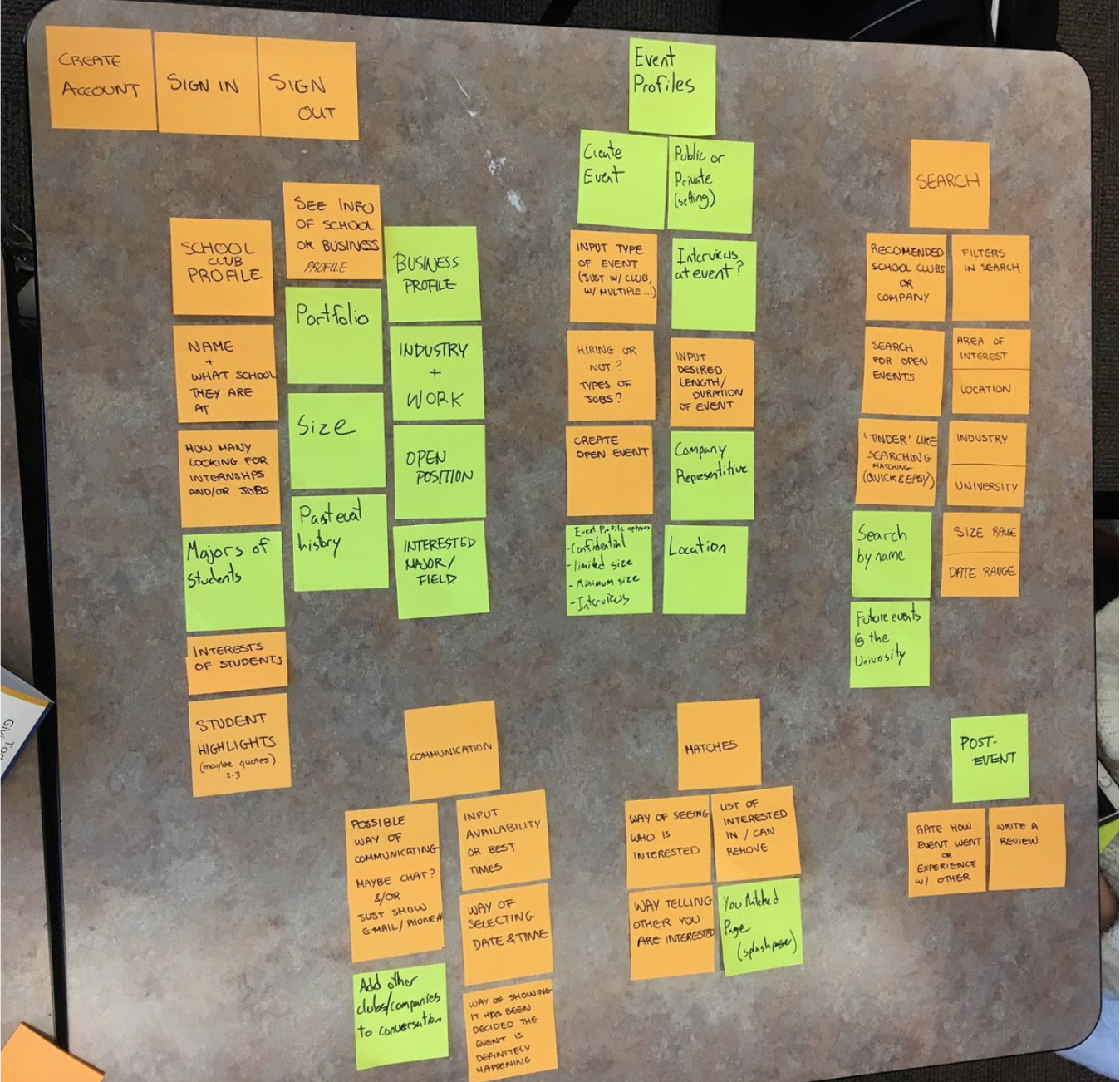
As our team moved from concept to ideation, we brainstormed possible features then organized them by categories and importance. We came up with seven categories: sign up/sign in, view university/company profile, event profiles, search, communication, matches, and post-event. This step helped the team determine which categories and tasks we should focus on.
STORYBOARDS
HOW MIGHT WE QUESTIONS
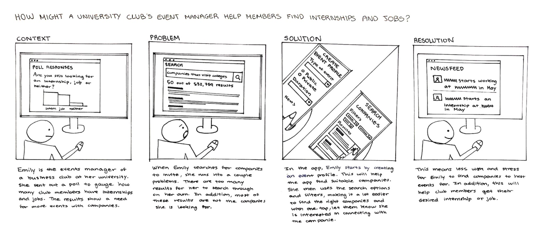
How might a university club’s event manager help members find internships and jobs?
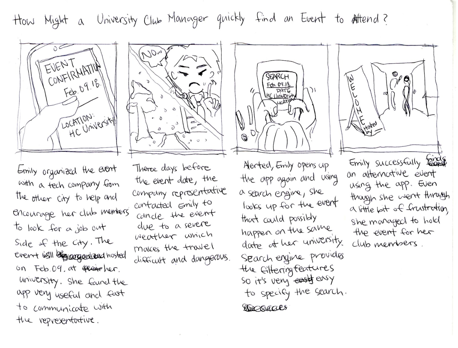
How Might a University Club Manager Quickly Find an Event to Attend?
How might an industry professional recruit more job or internship applicants?
WIREFRAMES ITERATION 01
BRAINSTORMING
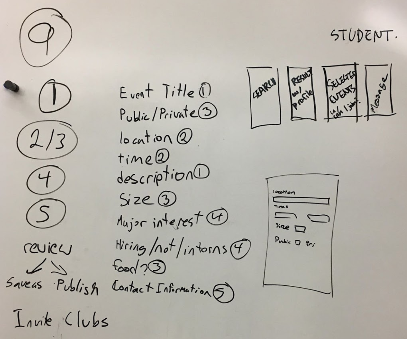
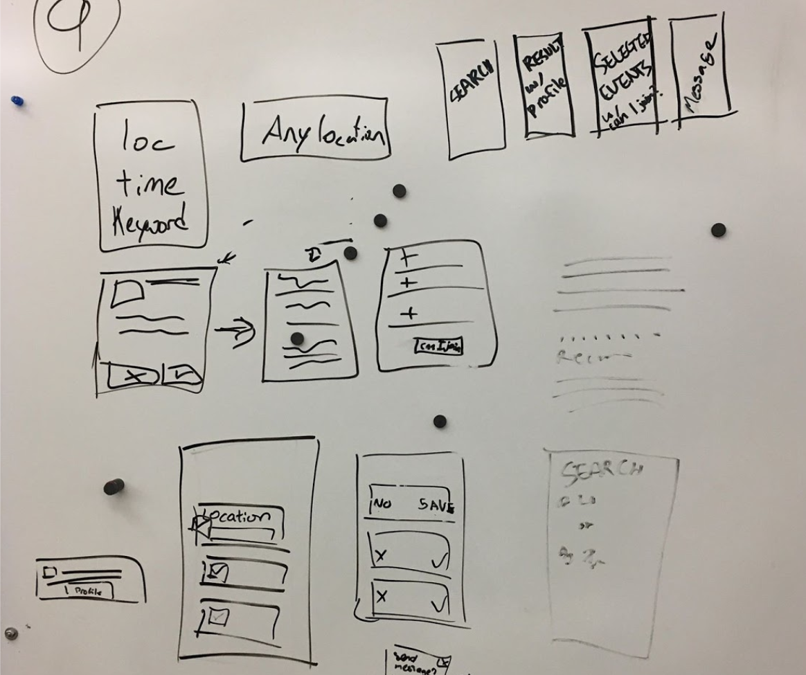
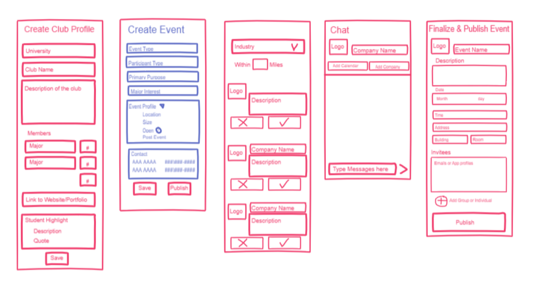
We started by brainstorming as a team what should be included in each task flow and how information should be grouped. We then sketched out some basic flow and wireframe ideas on a whiteboard before moving on to digital sketches.
ITERATION 01
From this first iteration, we came to the conclusion that we want to minimize the amount of scrolling up and down in the app. We therefore decided to separate the information into different screens instead of displaying everything at once.
WIREFRAMES ITERATION 02
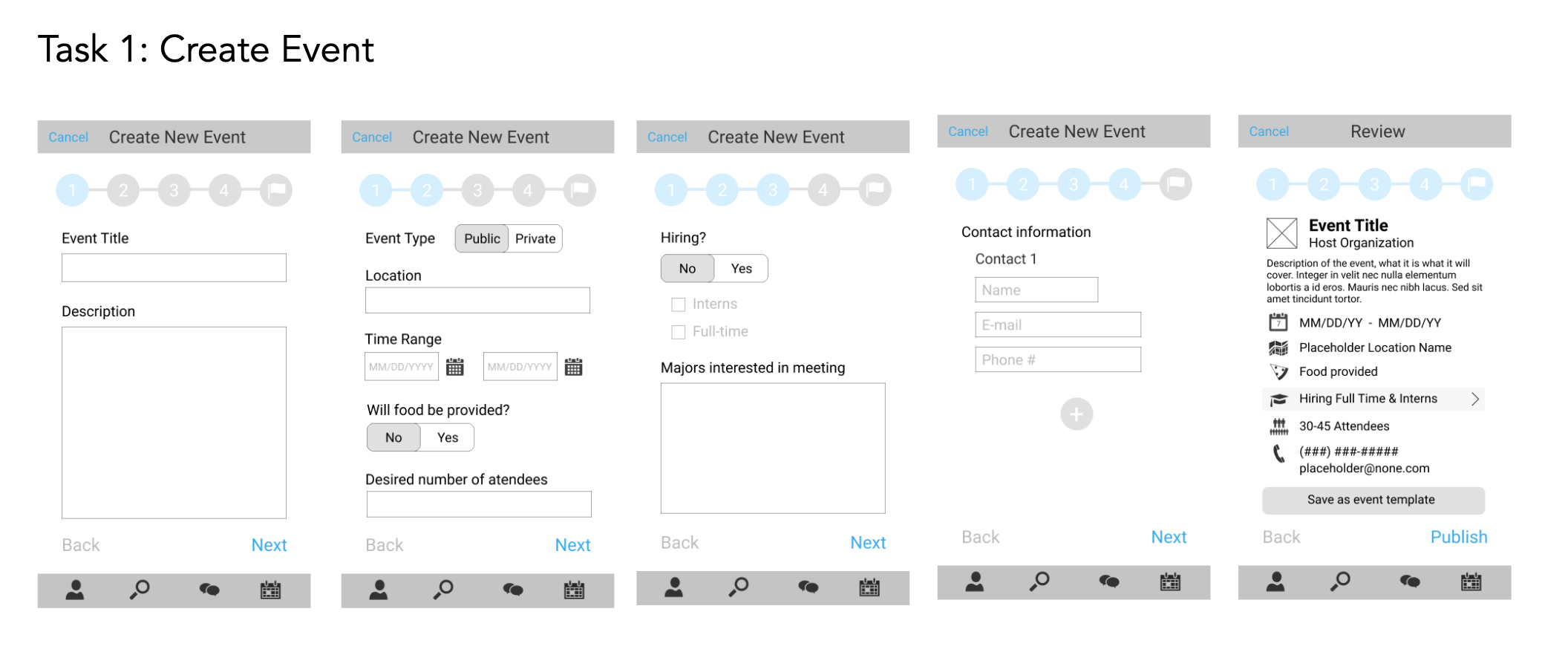
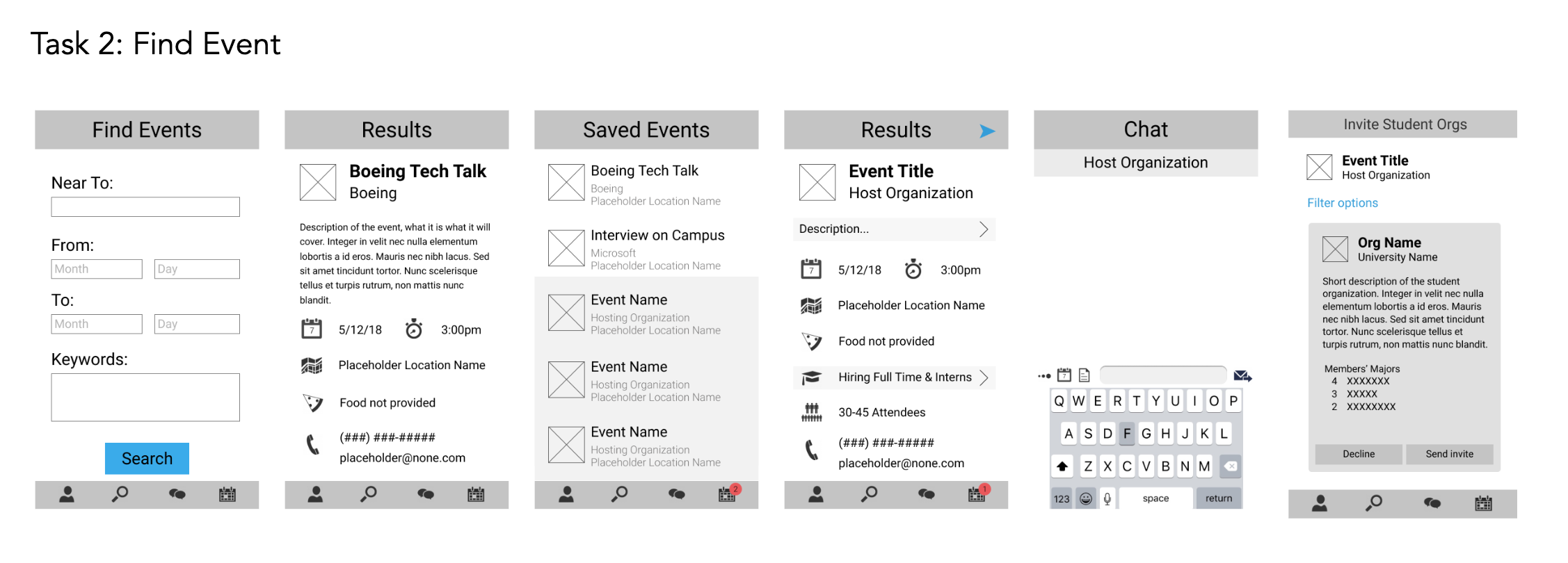
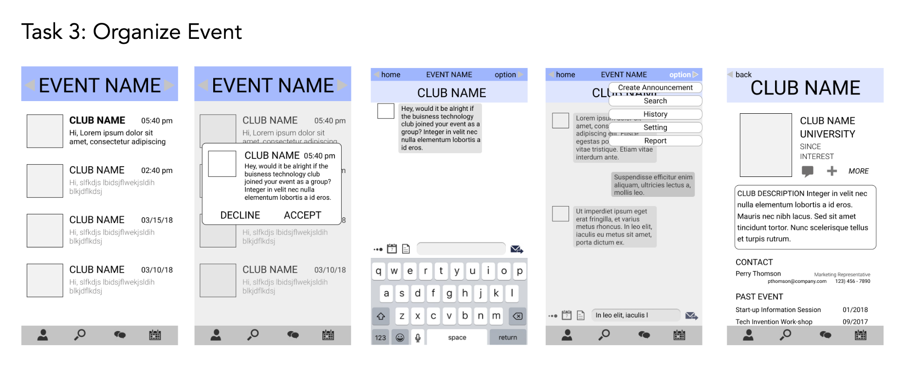
At this stage each team member was assigned one task to create a second iteration of wireframes for. We successfully removed up and down scrolling from the app, and made the connection between tasks clearer.
USER TESTING
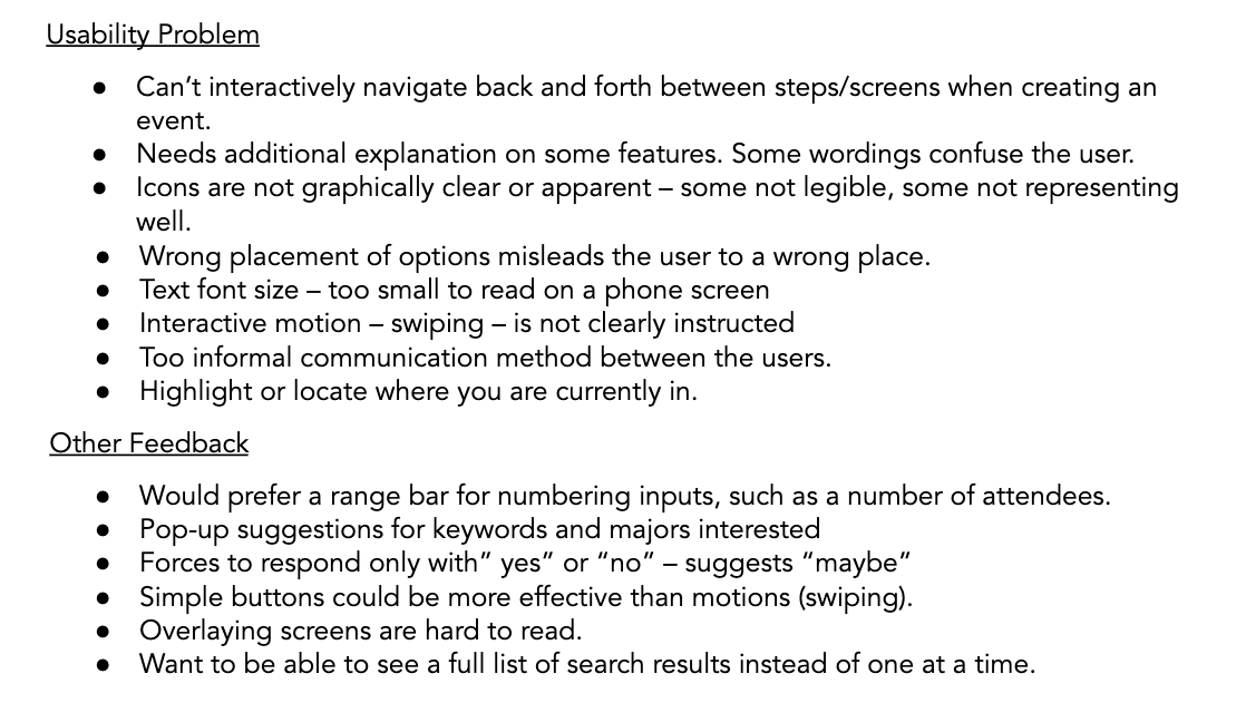
KEY FINDINGS
Wordings and icons are not articulated and placed well – confuses and misguides the users
Interactive motion, such as sideswiping, is not clearly instructed.
Limited navigating paths and ordering of information – inconvenient and inefficient in time.
NAVIGAION MAP
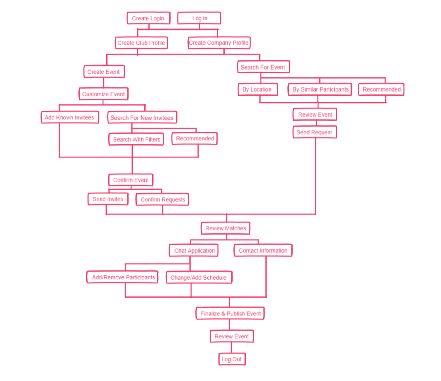
Creating the navigation map for the app made our team realize how much more complex the flow of the app was. There was many details we had not figured out as a group. However, in the process of completing the navigation map, we filled those gaps in our design and made the necessary adjustments in our designs and wireframes.
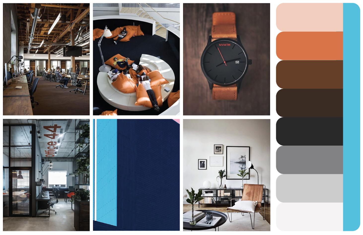
MOOD BOARD / STYLE SHEET
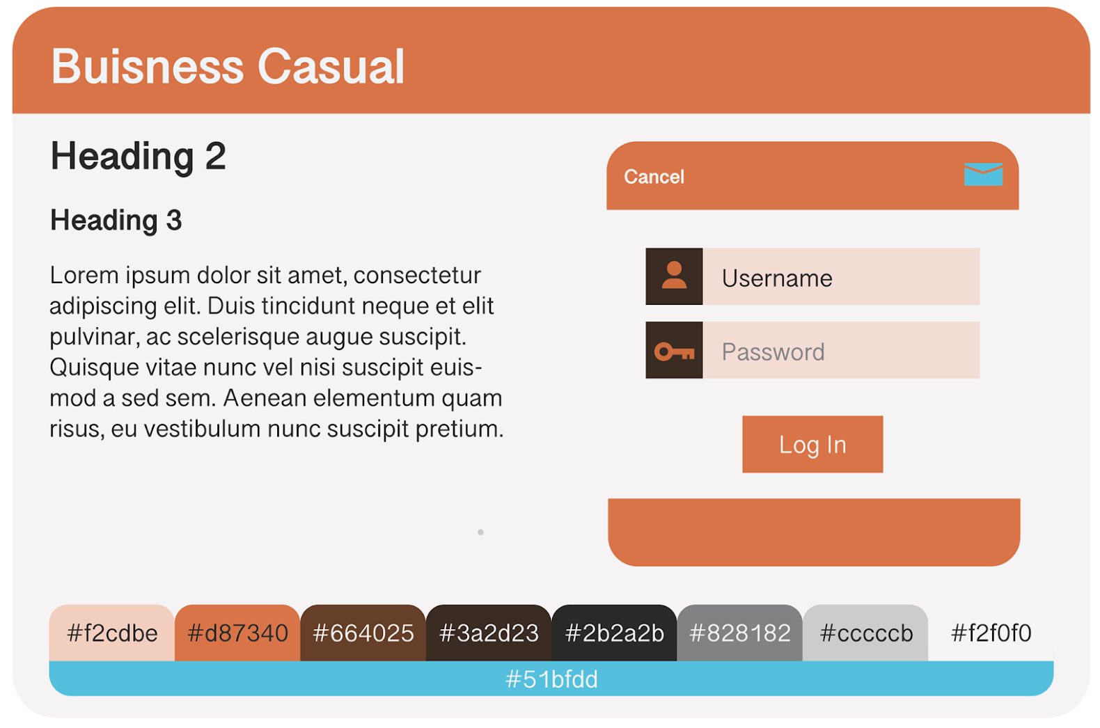
FIRST DRAFT
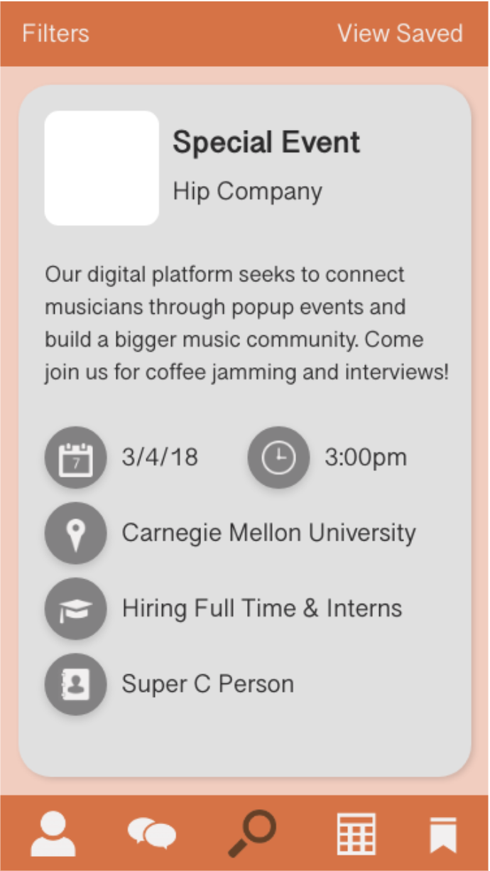
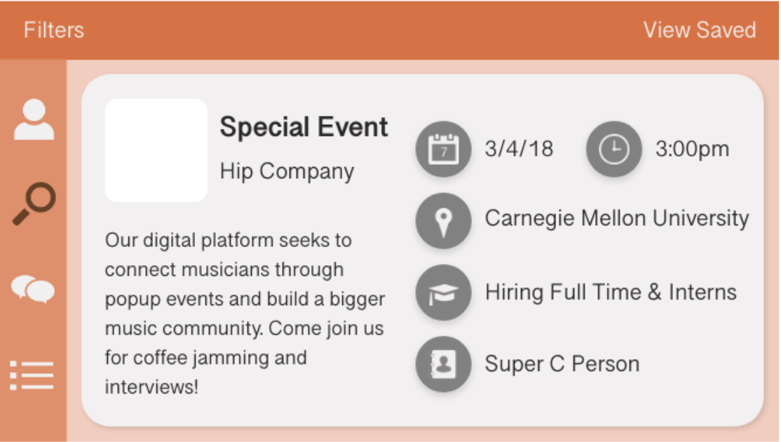
This is the set of screens we designed to develop the design language of the app as a reference. While we liked the direction they were headed we felt the color was a little overwhelming.
SECOND DRAFT
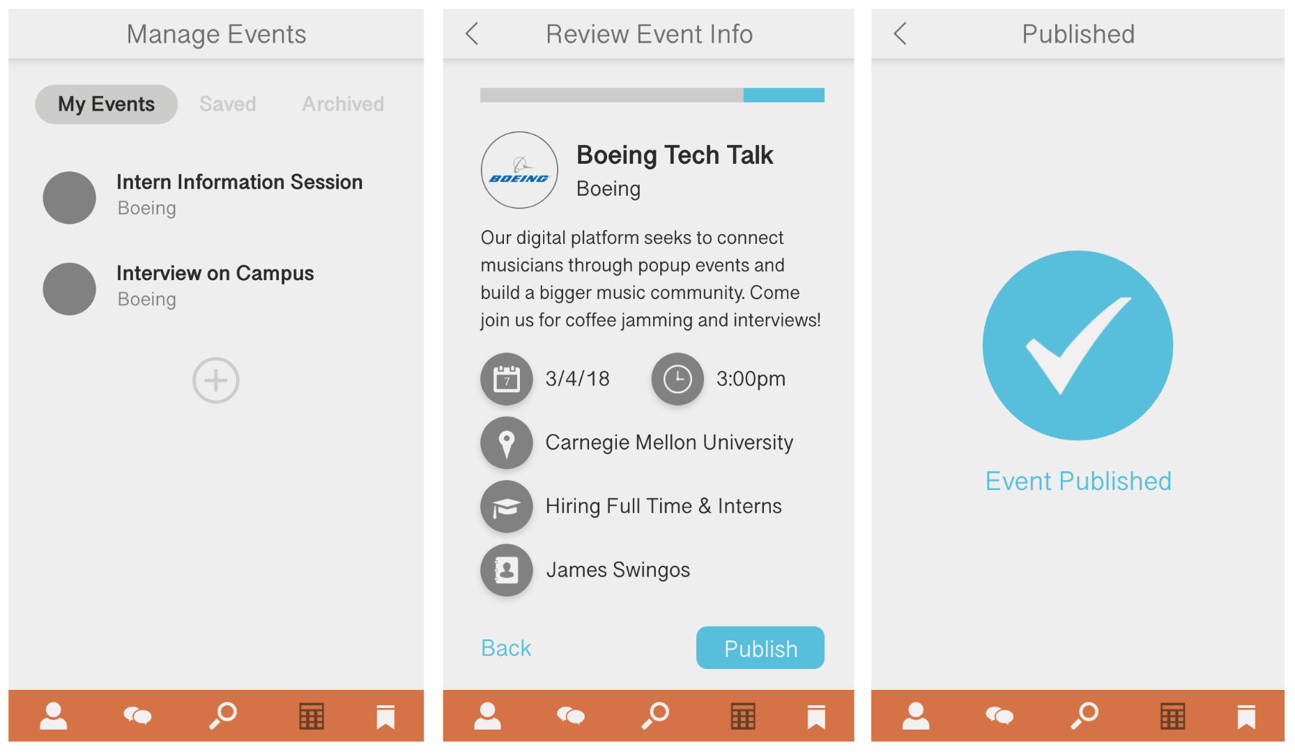
This next round of screens was our first attempt at a full design of the screens we wanted to show for our clickthrough. We made a lot of refinements as we went, primarily in the header/footer and color palette. There is still lots of inconsistency between pages however, particularly around buttons and how to use rounded or straight corners.
FINAL DEMO
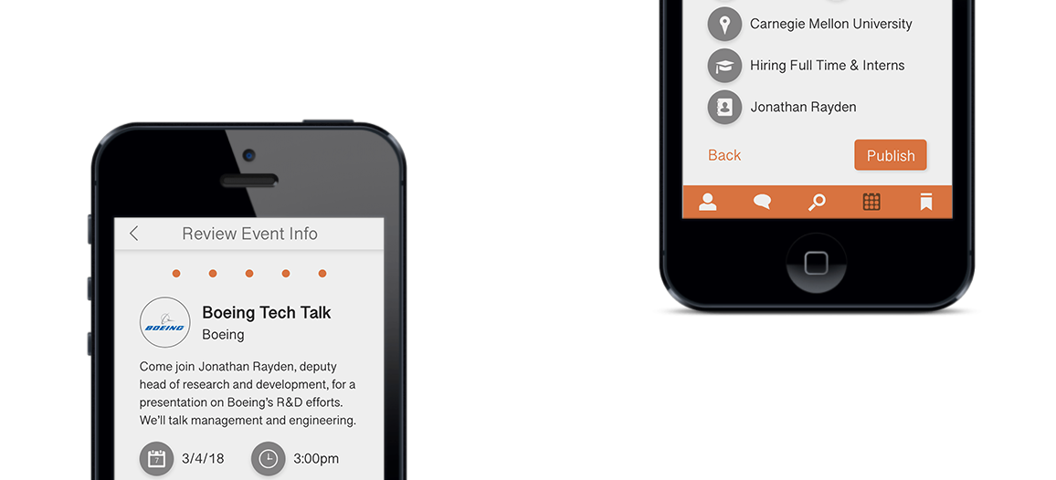
CREATE AN EVENT
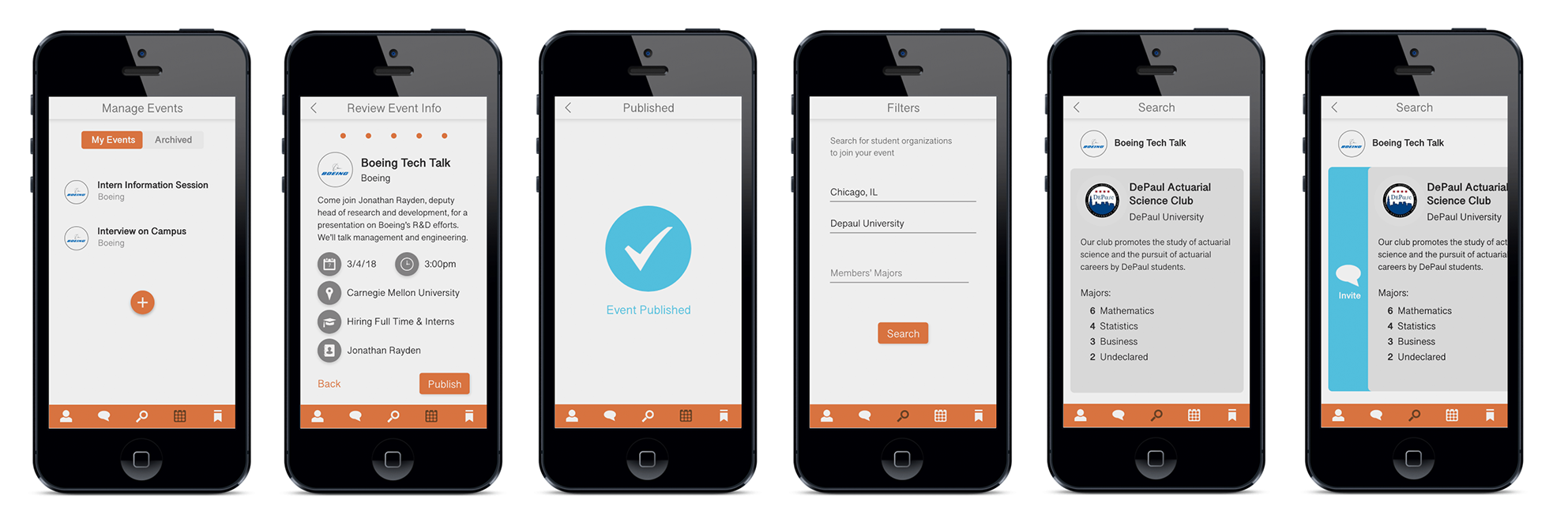
FIND AN EVENT
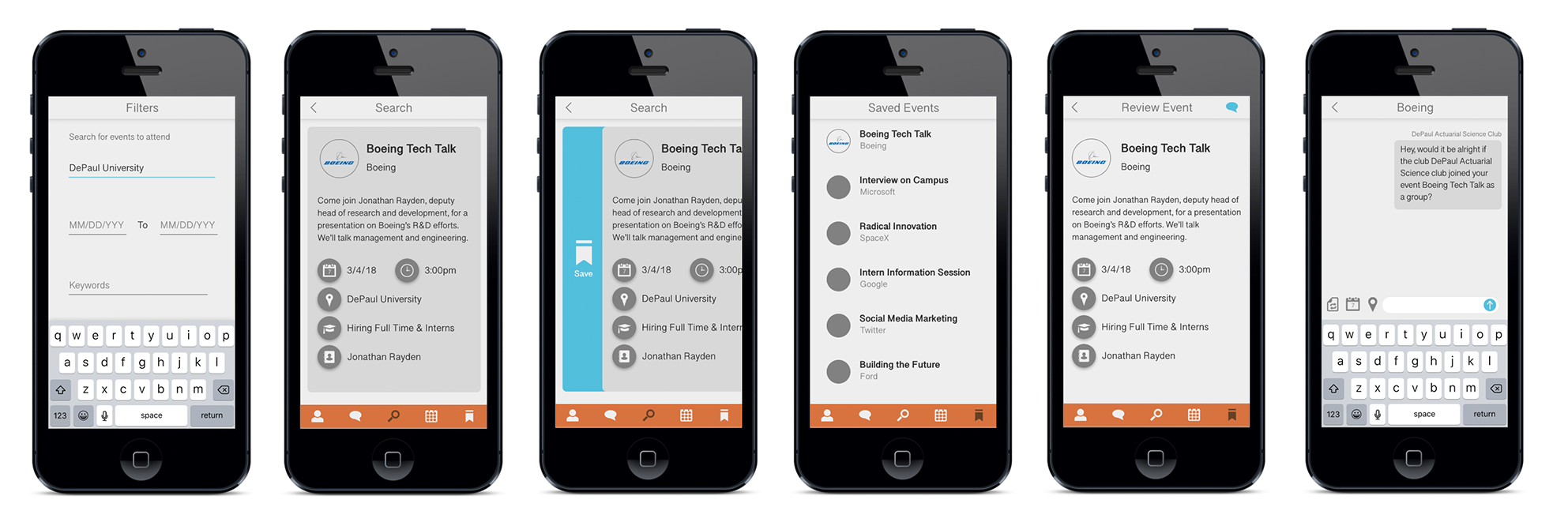
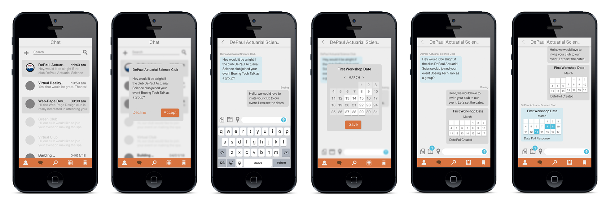
ORGANIZE THE EVENT (COMMUNICATION)
